Mandom corp. Global Site Renewal
Along with expansion into emerging markets, we prioritized the drastic improvement of the usability of our existing site
Mandom corp. has emerged as a titan of the men’s grooming industry. Since its release in 1978, their GATSBY line has amassed overwhelming popularity among young Japanese men, establishing itself as a megabrand. The brand has also accumulated many devoted fans overseas. And is a global site has become an important information center.
The company has several ongoing projects aimed at building an effective website. While continuing to look for the ideal of the site, keep going steady and high precision improvements, Mr. IICHIRO KAGAWA(Mandom corp. GLOBAL E-BUSINESS DIV. ASSIST TO MANAGER) and Shoma Terai(Loftwork Inc. Senior Director) looked back on this project, which began in March 2013, to examine its major issues and results.
Terai (Loftwork) This project was meant to improve the US site for GATSBY hair wax products. How did that provide an opportunity to undertake a global site renewal?
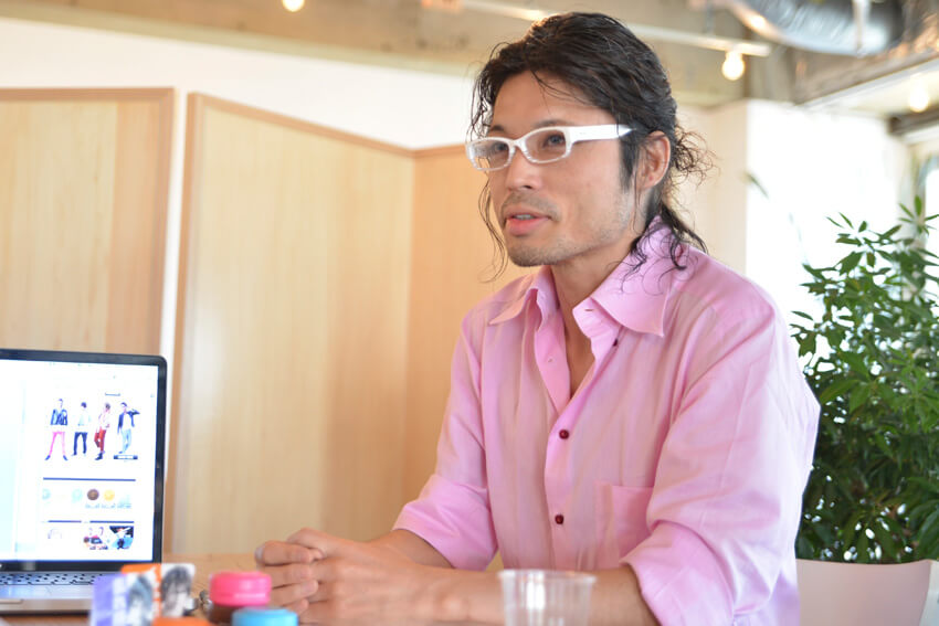
GLOBAL E-BUSINESS DIV. ASSIST TO MANAGER Mr. IICHIRO KAGAWA
Kagawa (Mandom) When we first launched our global site, we started getting a lot of US-oriented business, and much of the content became US-oriented. Before long, as conversations came up about expanding into the UK, country-specific localization became a necessity because information about the different products and promotions we were offering in each country differed. So I thought of the localization as an opportunity to improve the site itself at the same time.
Certain improvement measures based on the access analysis improved numbers across the board

Terai First we analyzed the present situation using Google Analytics.「What is hair wax」Through that we established that though traffic to the “What is hair wax?” page was high compared to other pages, the bounce rate was also high. Presumably, many US visitors were not familiar with hair wax products, and the perception of hair styling products was also quite different compare to other Asian countries. Under such circumstances, the high bounce rate of these valuable users, who had enough interest in hair wax to search for it, was a terrible waste. Therefore, our first proposal was to do something to improve this page.
On the previous “What is hair wax?” page, the main content was a comparison between the functional aspects of “wax” and “gel”. However, based on the hypothesis that for users in the US who were not familiar with hair wax, “the minute functional differences are irrelevant,” we altered the appeal point of the page to the user’s perspective, “How can using hair wax benefit me in my everyday life?”
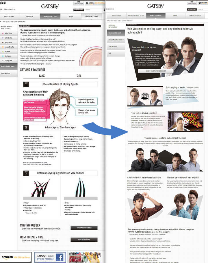
Renewal Large images and video simply explain the advantages of wax, and links to products are provided.
For other content, we investigated internal SEO measures. Concrete measures we proposed include URL standardization and modifications to titles and description tags shared on all pages.
Kagawa With the work of modifying the titles and description tags, we took some tentative copy and we translated it, but language that is good for getting hits on a search engine is different from what we, as manufacturers, would think of. We realized that what we want to tell users may not be what they are looking for. We thought the prioritization of information was professional work, so we decided to let Terai handle all of it. As a result, the influx from organic searches increased an astonishing amount.
Terai Additionally, we analyzed what was causing some pages to load slowly, running various tests such as Javascript justification and image compression. Using applications to limit bandwidth, we conducted speed tests based on the average overseas Internet connection.
Kagawa I believe we have seen considerable results, not just in the technical loading speed, but something has changed on the level of experience. One more important part of this renewal was usability. Functionality had become secondary to an emphasis on design, so I wanted to reorganize the information and make links easier to navigate.
Terai I added a product description caption to the product links where before it was only a product image. I changed the Amazon link button name from “Official Store” to “Check the Price on Amazon”. This is for eliminating the sense of “Buy this!” and for giving the user a “motivation to choose.” This way, I designed it to be as easy to understand as possible, and fun, so the user would want to click on it.
Kagawa We removed the link to Amazon from the product list page, integrated the product details and “how to use” pages into one page, and implemented the drastic changes that you proposed. Those suggestions continue to get us results, so I guess we had no choice (laughs).
Converting the site from a basecamp into a stage for creating more fans
Terai After the renewal, the number of things like PV’s began to increase, but what have been the practical results?
Kagawa We are hearing within the company that the site is easier to use and more attractive. If our users feel the same way, I think that will show up in the numbers in a good way.
Terai Why did you choose Loftwork?
Kagawa I felt there was an elegance and flexibility to the thinking behind your organizational structure. Your system of assigning people to projects that specifically suit them is refreshing and interesting. I thought that a group like that is likely to have strong ideas. In practice, we have received insightful, well-formulated hypotheses and very persuasive proposals. It has been very eye-opening. Even when there are disagreements, I come away from the argument with a good feeling. You have exceeded my expectations–you’re simply the best!
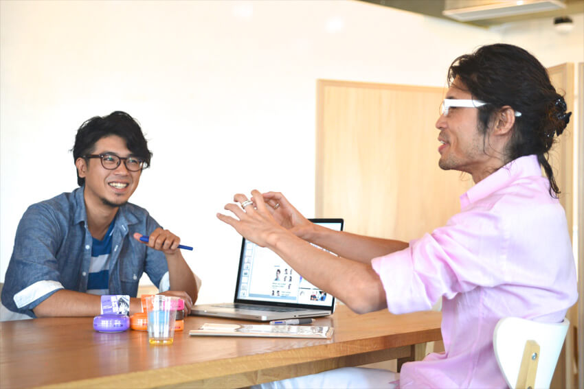
Terai Thank you. I heard over and over from the beginning that you wanted to start small and see the results as we went along. It was easy to move forward thanks to your quick decision making and resolve. Those are important requirements for moving swiftly and effectively through any project. But the project is still ongoing. Are there more improvements you want made to the site?
Kagawa The home page now has a lively, fun feeling, much like the GATSBY brand, and has become highly usable as a homebase for spreading the word about our products. Our goal is not always just bringing more visitors to the site but also we want to continue thinking about creating easily spreadable information and mechanisms for delivering it.
Terai If you are able to respond to user feedback in real time, I think you will have a site that becomes a part of peoples’ lives. I will definitely rack my brain for ways to keep exceeding your expectations.
Related Links
※ Contents, customer information, and director information in charge are those at the time of publication of this article. Currently it may be different.


