Creating a Seamless Wayfinding Experience At Taipei’s Far Eastern Xinyi A13 Department Store
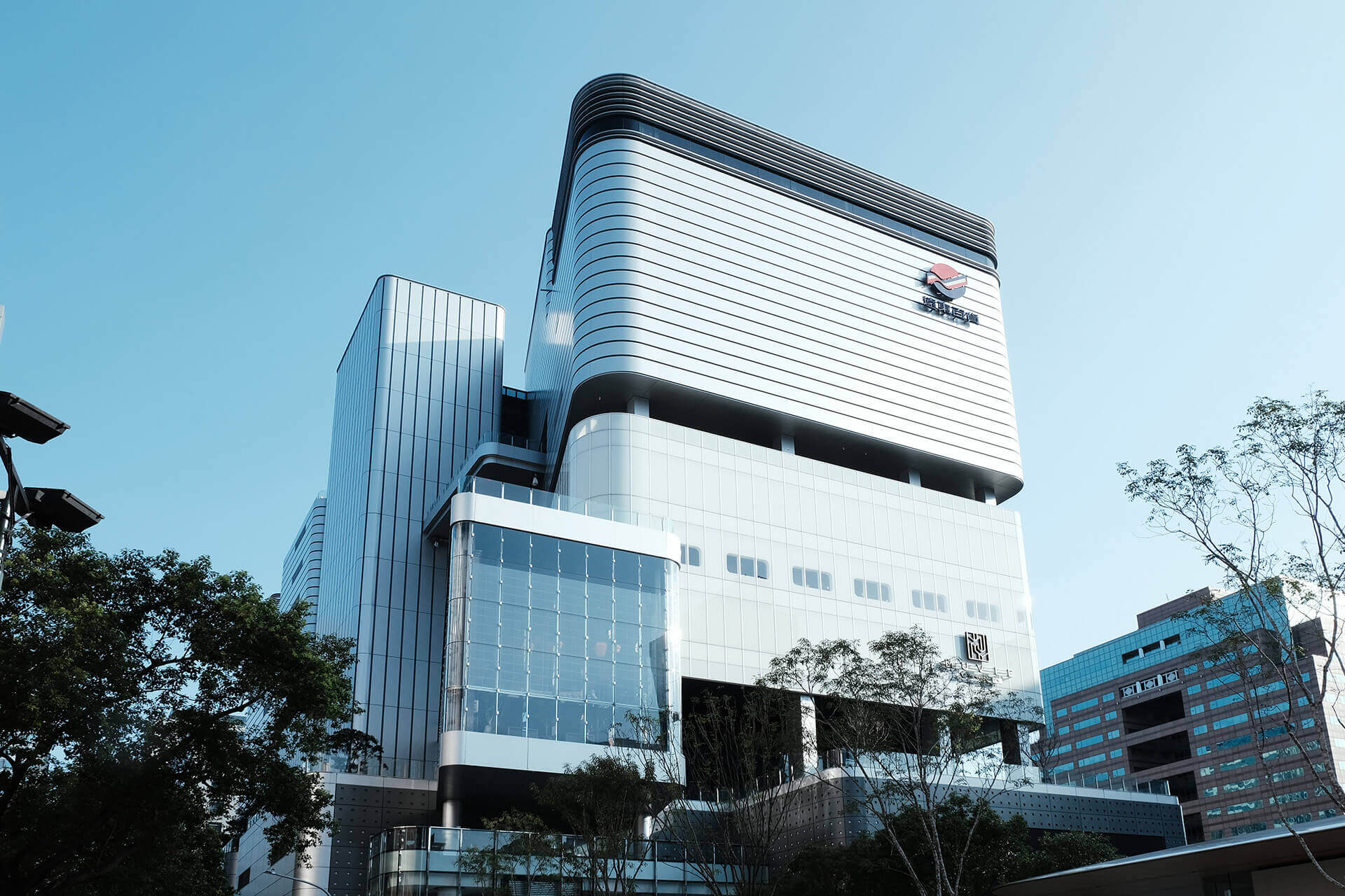
At the end of 2019, Far Eastern Group, Taiwan’s long established department store chain, opened its newest digital department store, Far Eastern Xinyi A13, in Taipei’s Xinyi District, ushering in a brand new smart shopping experience.
One of the distinctive features of the Far Eastern Xinyi A13 is its architectural design, which features floor blocks stacked on top of each other like floating blocks. But how do you allow people to move freely and with ease within the blocks without getting lost? To solve this problem, Loftwork Taiwan and Far Eastern Group worked together to combine wayfinding design, signage and customer perceptual maps to create a seamless customer experience.
Designing a wayfinding system is part of designing the customer experience
It’s often very difficult for customers to intuitively remember the accurate positions between shops and buildings in Taipei’s bustling Xinyi District, even when they have been to the area many times. Wayfinding design uses text, symbols and organized instructional systems to provide accurate orientation information to help guide users and make them feel more at ease to explore and move towards their destinations.
Customers visit department stores for many reasons, sometimes seeking freshness in their lives through a casual shop or meeting friends and family. As such, they experience not only the service of the department store, but also rely on its signage for a smooth journey, making wayfinding an important and indispensable tool in elevating the physical user experience.
Integrating architectural characteristics through research and analysis
With transparent areas, a partially open air escalator and a huge theatre, the Far Eastern Xinyi A13 building is narrow, and its exterior looks like boxes of different sizes stacked on top of each other. One of the major challenges in designing the wayfinding system for the building is figuring out how to successfully guide customers’ movements while also increasing their desire to move to explore other floors and build their own perceptual maps.

The importance of horizontal and vertical guides
Wayfinding design must consist of both horizontal and vertical guides in order to satisfy the needs of every type of customer. After gaining foundations from analyzing customers’ main dynamic paths and completing horizontal analyses of each floor, Loftwork completed a cross-comparison between the main entrances and exits and the tools that aided vertical movement, which allowed for a better understanding of the overall connectivity and flow of the building system.
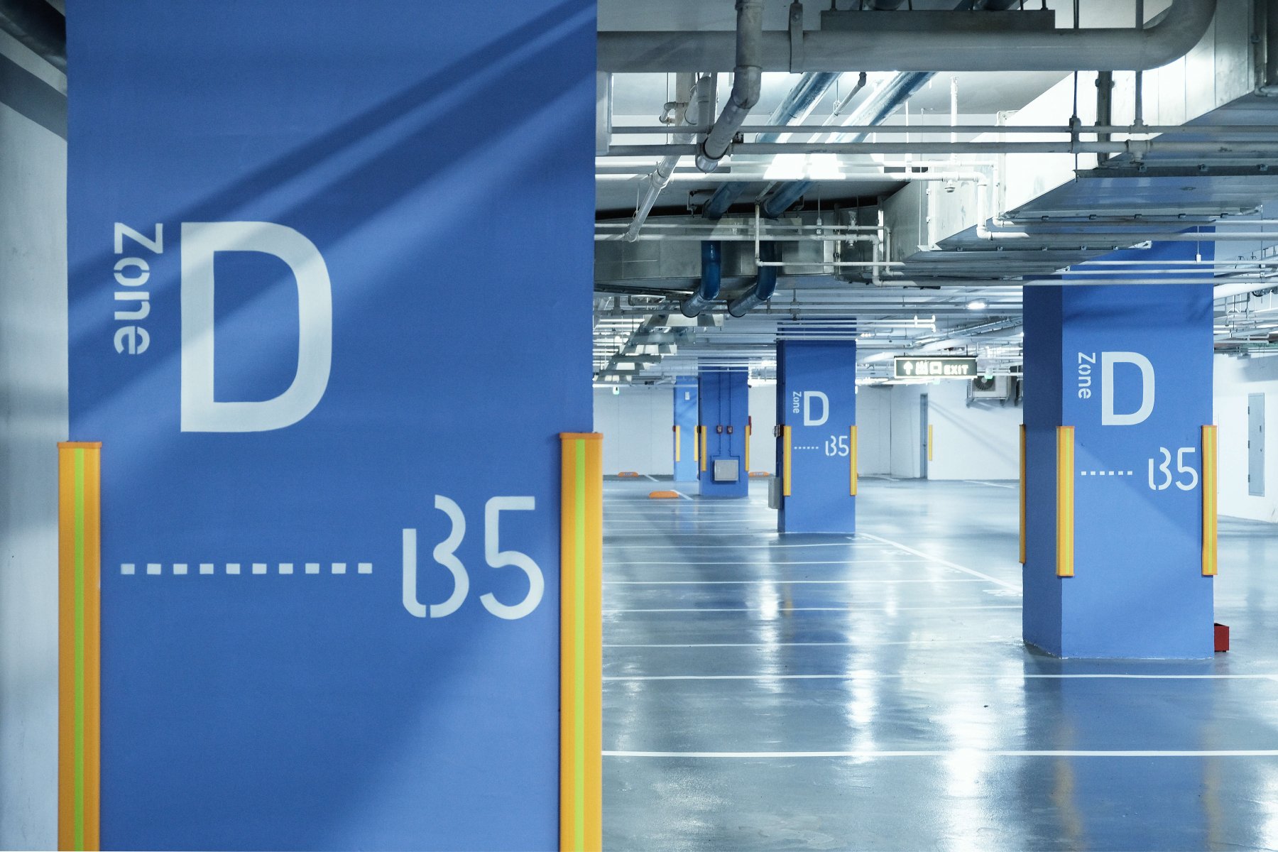
Although the first floor and the parking lot usually serve as the customers’ starting point in department stores, Far Eastern Xinyi A13 has an additional exploratory entrance. Customers can not only enter the department store through B2, but there are also three direct cross-floor escalators to reduce the amount of time it takes for customers to move up the building. The building is split into three boxes of customer experience of B2-1F, 4F-7F, and 7F-10F, allowing for public movement up and down.



From point to line, continuing a continuous conversation
After understanding the key nodes of the vertical guides and the overall wayfinding structure, the next step was to enhance the customer journey experience through an emotional narrative. What kind of wayfarming language can create trust through continual exposure in creating a customer perceptual map?
The key concept of this wayfinding system is to create an intuitive and aesthetic dialogue-like interaction with customers, actively conducting a continuous dialogue. Far Eastern Xinyi A13 integrates the three main elements of “chic”, “sophisticated”, and “intuitive” to demonstrate the building’s elegant, exquisite and deeply aesthetic wayfinding system.
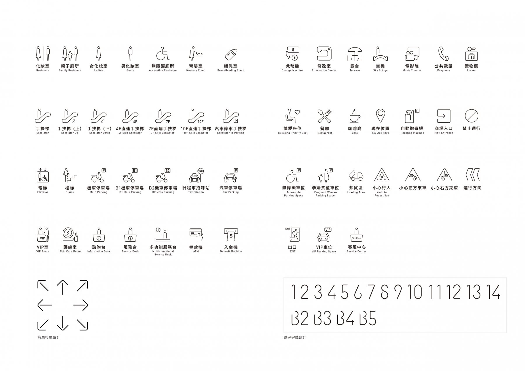
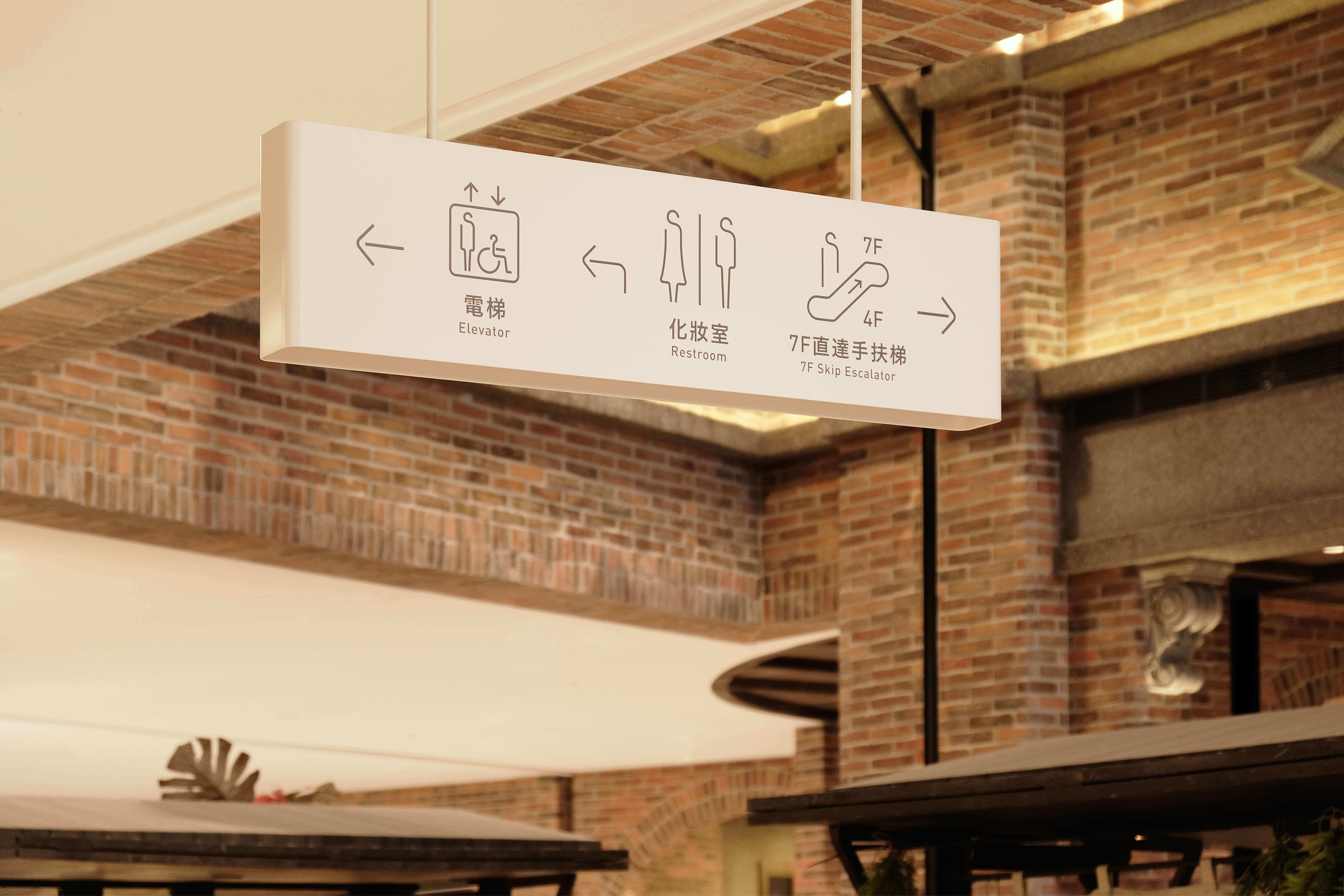
To do this, Loftwork chose to use a continuous thread in the wayfinding system’s signage icons, in order to outline the unique elegance of Far Eastern Xinyi A13. A spectrum was also used to carefully analyze the material of each metal and how 3D it was in order to create a sense of weight. Each floor’s main facilities are clearly outlined with a symbol developed from the concept of a continuous thread.
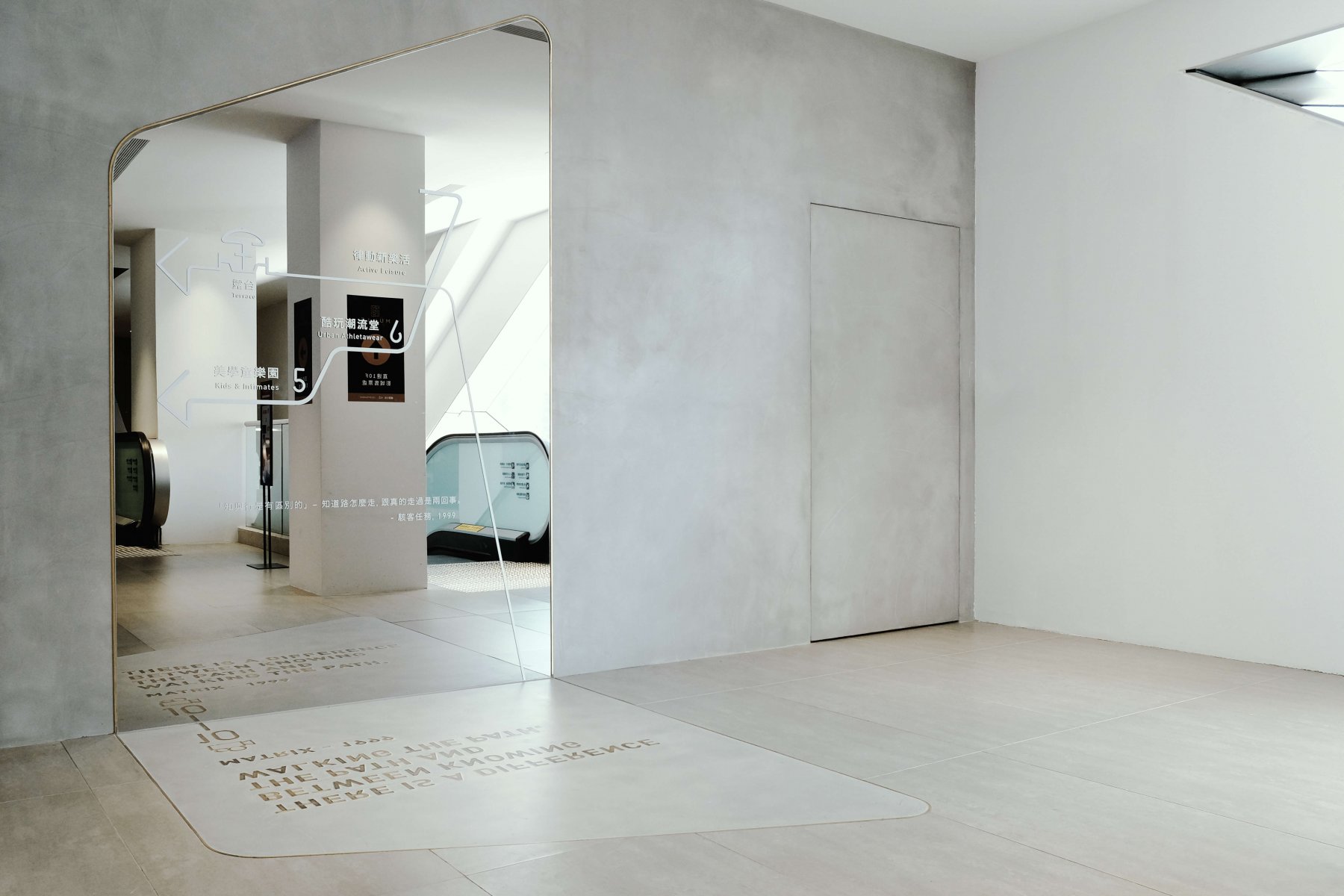
For customers, department stores exist the way runways do. In arranging the signage icons of the wayfinding system, besides ensuring they were in the correct corresponding position, it was also important to avoid delivering too much information and making it difficult for consumers to comprehend, whether it was a hanging sign or the special signage across the floor from the escalator. The signage had to boost the interaction between the wayfinding system and the user, allowing every customer to discover and shape their own route and experience.
Members’ Voice
In the process of preparing for the new store, we were very clear about our goal of creating a totally different department store in Xinyi District that put the consumer first from the beginning to the end. Our core mission was to create a new consumer experience, finding an excellent team to help us execute the design concept was the most important for us. In our initial discussions with Loftwork, we discovered that Loftwork was the only design agency that understood us. They helped Far Eastern Xinyi A13 use a different, completely fresh perspective to approach wayfinding. This was seen as a traditional wayfinding system design involving architecture and interior design so most clients only considered the cost and dynamic path and direction, but the Loftwork team went above and beyond. Loftwork helped us find the perfect balance between art and science. Thank you Loftwork and its team of designers who are brave enough to make groundbreaking, innovative and creative designers. We are very satisfied with their work. — Monica Lee, Director of Digital Transformation Office, FEDS
Project Summary
Goals
- Designing a wayfinding system involves more than just designing signage; it’s about creating a path system that allows each and every customer to feel at ease and understand their own position and the direction they are going.
- Drive interaction between the flow of people and key floors by incorporating the spatial and distinctive features of Far Eastern Xinyi A13, such as the visually linked long escalators that move between the floors so that customers can move freely and design their own perceptual maps.
Scope of work
- Develop wayfinding concept and define wayfinding on key floors
- Design wayfinding system for the department store
- Design wayfinding system for the parking lot
- Design signage and icons
Project dates
November 2018 – March 2019
Project members
- Client: Far Eastern Group
- Project Manager:藤原 悠子
- Creative Directors:黃駿賢(Tim Wong)、藤原 悠子
- Project members:許瀞予、楊雅婷
- Index system design and planning: Loftwork Taiwan
- Graphic designer:石妍心
- Space photography:陳奕筑


