
Using Graphic Design To Stimulate A Sense of Wonder in Children at AkeruE
Introduction
Opened in April 2021, the Panasonic Creative Museum AkeruE is a new “creative museum” that combines elements of a science museum that nurture the intellect with those of an art museum that nurture the senses.
Understanding the importance of giving an identity to a museum that no one had seen before, Loftwork’s LAYOUT Unit, which produced the facility, decided to hire a graphic designer, Tomohiro Okazaki, to use visual design – from the logo to the signs and tools used in the facility – to inspire a sense of wonder in children and enhance the experience of AkeruE.
Background
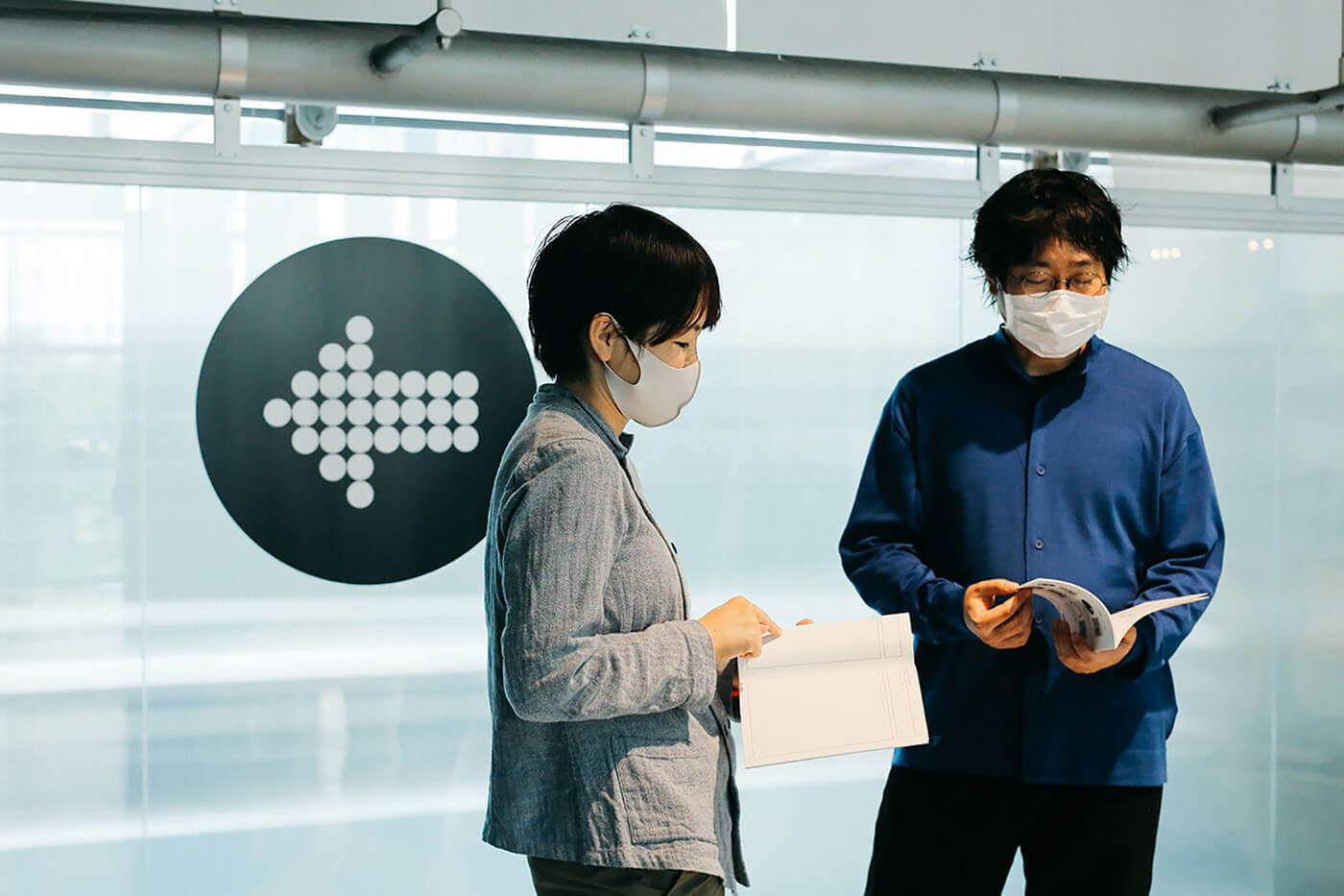
To create graphics that would inspire a sense of wonder in children, Loftwork chose to work with Tomohoiro Okazaki, the founder of SWIMMING design studio, due to his experience designing works for children, including “Design Ah!”, a design-themed program broadcast on NHK Educational Television aimed at nurturing children’s design perspectives and sensibilities.
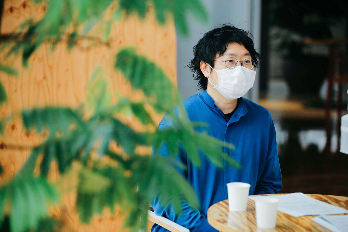
Okazaki said he was drawn to the project based on its approach of STEAM Education, which integrates the arts with STEM, allowing children to be exposed to natural science, physics and mathematics while having fun and creating opportunities for creativity. In that sense, designing for children who will create the future is no longer just a job, but “being a human being,” he said.
For the project, he single-handedly created a variety of outputs, including the AkeruE logo and signage.

A Sense of Familiarity and the Room To Change
Okazaki wanted to create designs that had room to go beyond the types of logos that already existed in this world. As such, the logo was based on the premise that it could be constantly updated, the same way that AkeruE aims to be “constantly changing” – whether it’s the space, exhibitions or individual communication tools.
The idea was to approach the logo from a sensory perspective with the goal of creating something that people could feel familiar with and want to keep changing, the same way that a block of wood that is repeatedly used gets scratched or rounded off but fits perfectly in your hand.
Process
Design Beyond Logic, Based On Relationships
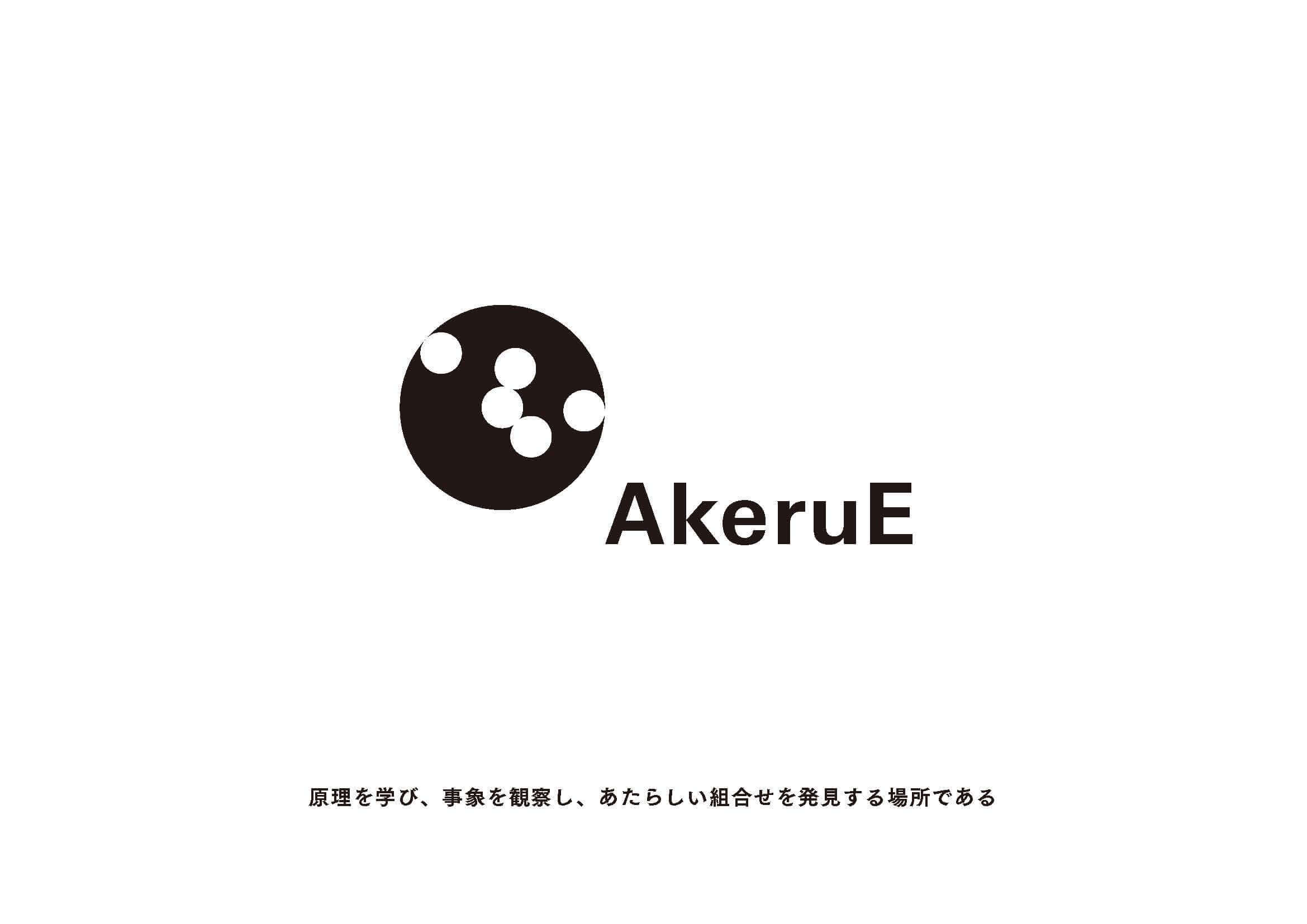
During the design process, instead of approaching it logically, Okazaki started by hand drawing a collection of patterns with just enough precision to give a feel for the design. Together with Loftwork, Okazaki came up with the idea of reconfiguring the logo for AkeruE, which, when read backwards, means “EurekA”, or “inspiration”.
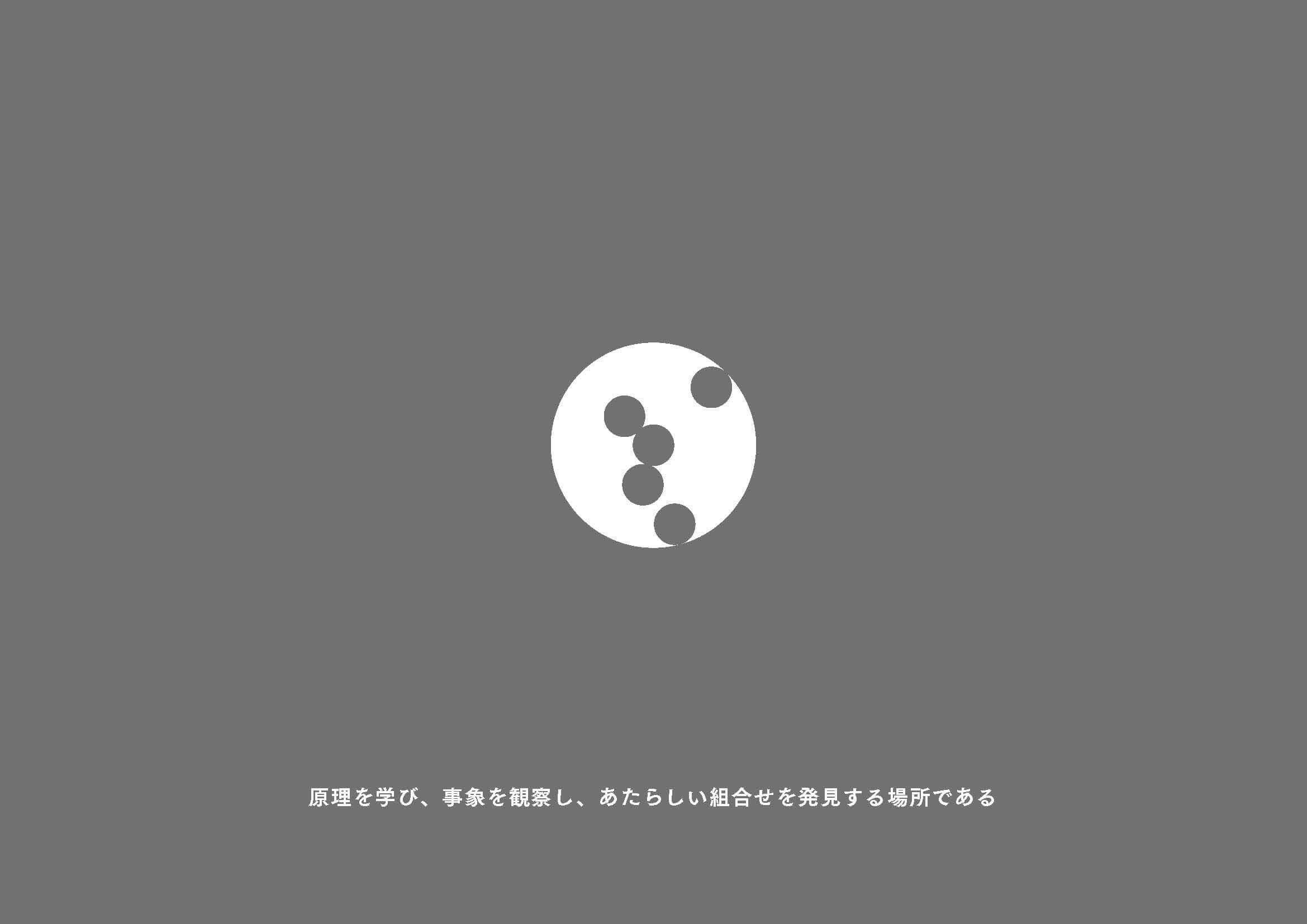
After learning about how the areas and content in the facility are not built around something but rather in line with it, Okazaki was able to start thinking about the interface of AkeruE as a whole, and from there, came up with the concept of “events and principles in motion”, which then led to the final logo, inspired by images of planets, electrons and gears.
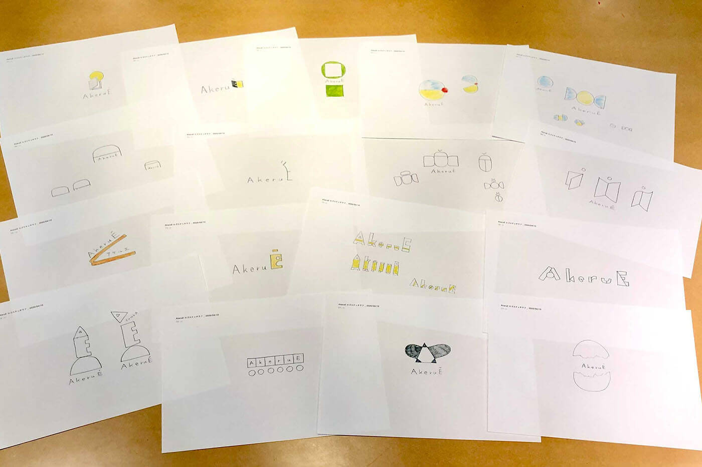
At this point, Okazaki had proposed seven ideas for AkeruE, one of them more abstract than the others – it was also the one chosen by Loftwork. For Okazaki, a designer’s job is to “bring out the best in a relationship”, rather than starting from scratch. It is also why he strongly believes that Loftwork, which has been involved with AkeruE for a much longer time than he has been a designer, was suited to make a decision based on its understanding and thus bring forward the design process.
Circles are a fundamental element in the history of design and have been used as a matter of course for a long time. The many elements of “circles” in the AkeruE space, such as the spinning table in the COSMOS area, the floating round sphere in the exhibition, as well as the space itself made of curves and round walls, are all results of Loftwork and Okazaki’s discussion on how circles can be used in various ways, and their quest to understand and study circles deeply together, even sharing nearly 100 topics among them related to round things and circles, before designing a logo that would be made up entirely of circles.
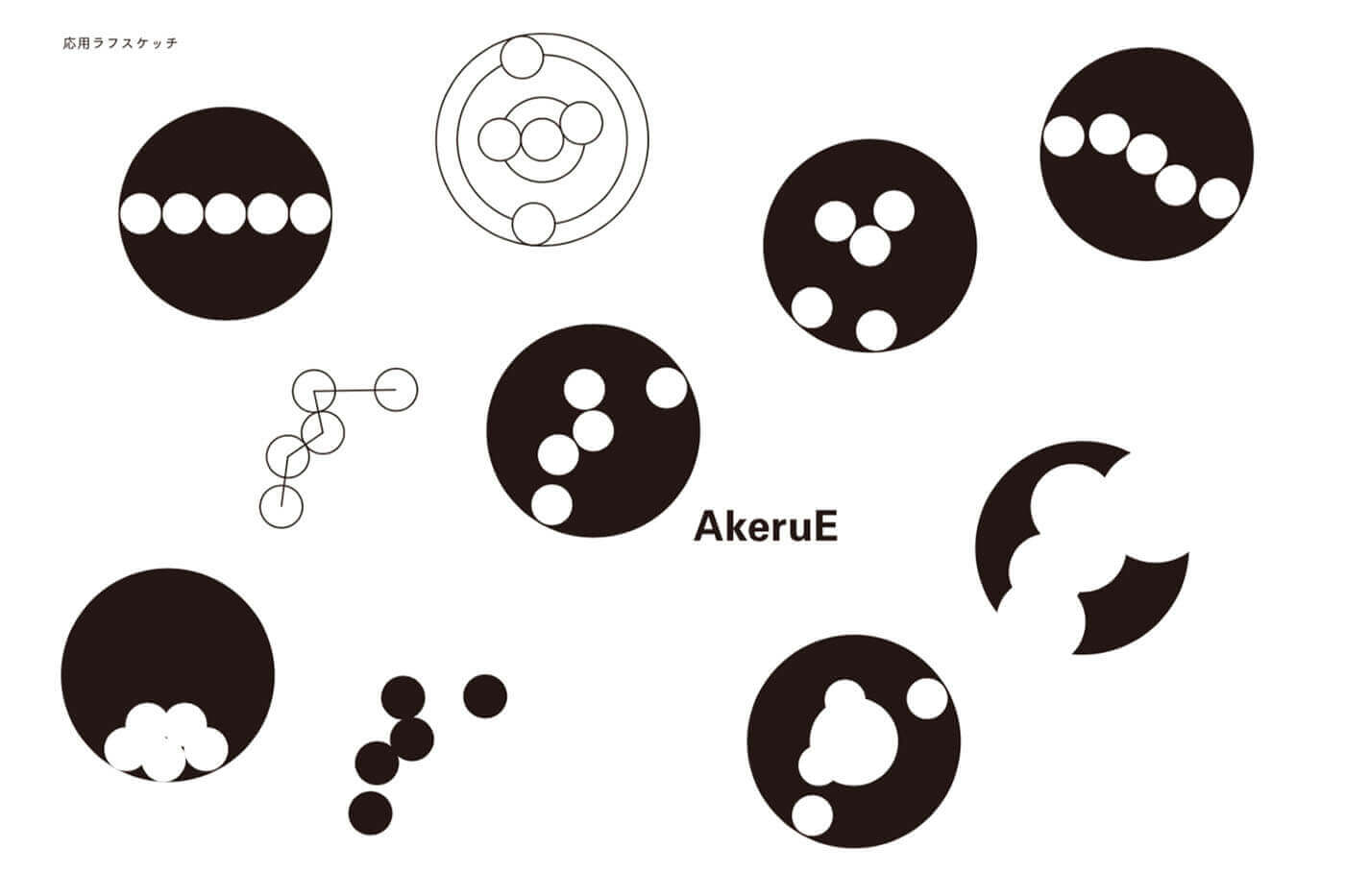
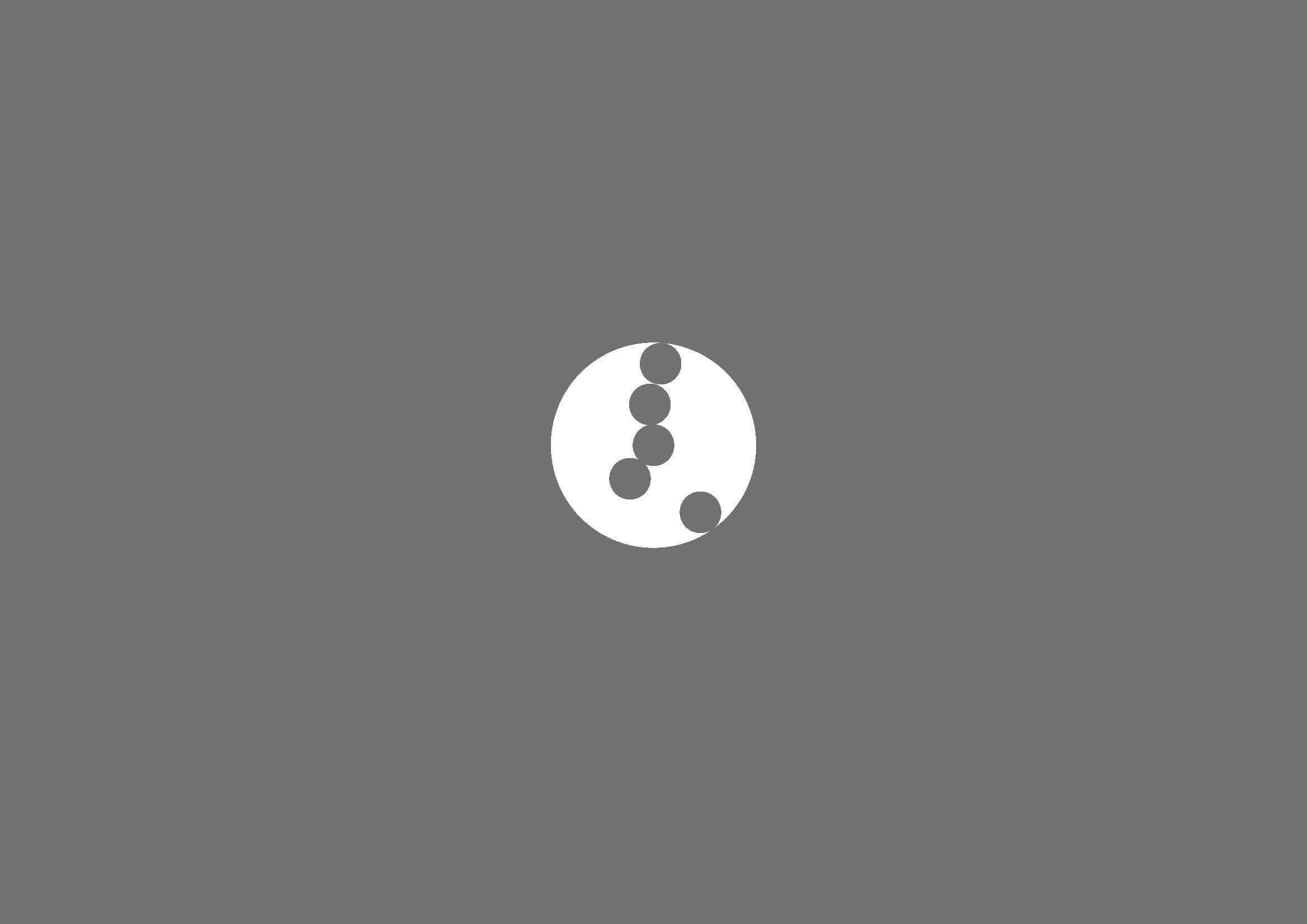
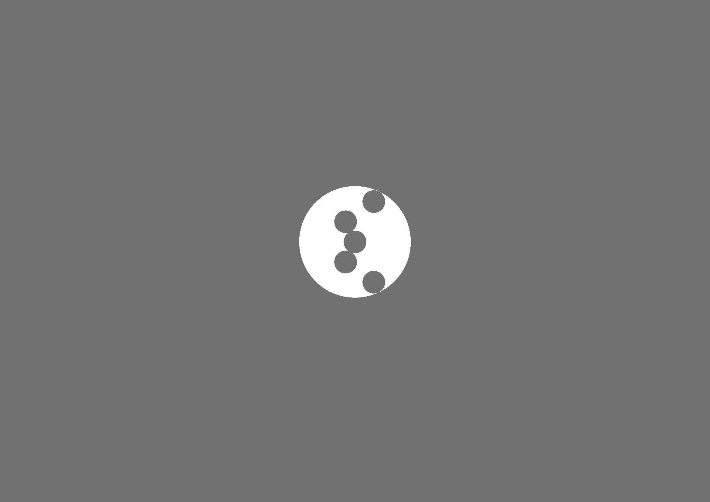
Deciding on the number of circles used in the logo, Loftwork and Okazaki looked to things in the world that related to “five” – five continents, five senses and five organs and so on, and came to the conclusion that five is neither too many nor too few, making it just the right balance for humans to grasp. Then with the help of Masataka Kato, a 100BANCH tenant who studies physics, they also had a lot of fun creating angles for the circles.

The keyword “circulation” came from Okazaki’s experience at the facility and his own design, which took inspiration from nature. He gave Loftwork a presentation on the idea of the logo, which is also connected to “circulation”, by moving the logo around the Zoom screen like a parapara manga, showcasing its rotation, constellation-like connection and development into various shapes.
The way the logo changes its appearance upon moving, and that it can be perceived in different ways depending on the viewer, perfectly matches the concept of AkeruE, where no “right answers” are given, but instead offers suggestions on how to enjoy it. That is also why there is no right answer to the logo – it is free and can easily become something infinite.
Concept Movie. Tomohiro Okazaki (design), Atsuro Oka, Kosuke Anamizu (music), Yaou Nishimoto (motion graphics)
Begin By “Trying” in an Ever-Changing World
In addition to the graphic design on the walls, Okazaki also took the lead in directing the background music and projection mapping in “Wormhole”, a mirror room that connects the third floor entrance to the exhibition space.
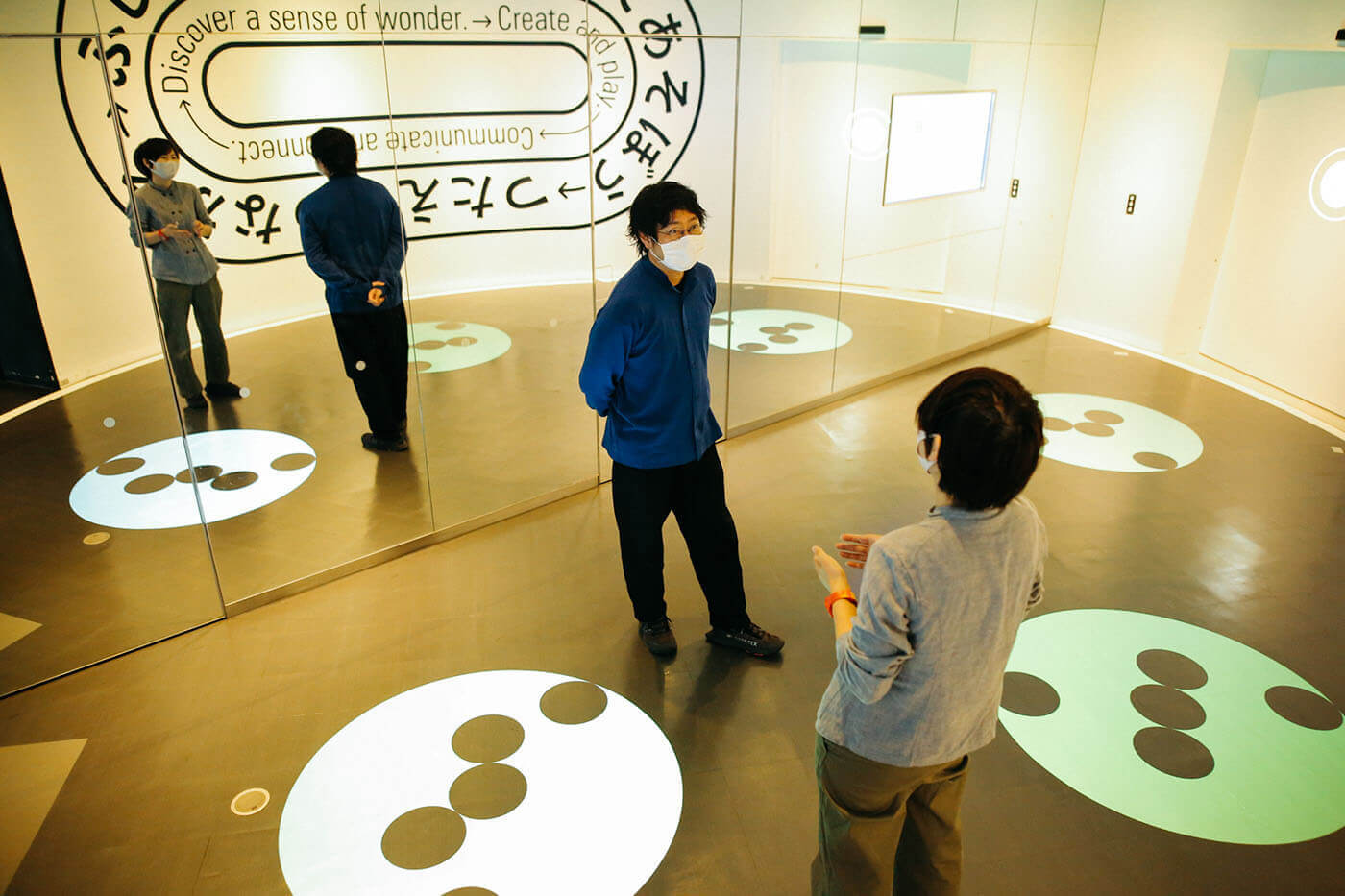
After doing most of their work remotely, it was finally the right timing for Loftwork and Okazaki to visit the site. They visited the site for AkeruE, which is still under construction, before starting working on the “Wormhole”. Around that time, Okazaki came across an artist working on a large painting named Akiko Nakayama, whose conversation with Okazaki helped him see the positioning and mindset of the wormhole more clearly.
From their conversation, he realized that for a space or a work of art, it is more important to experience the atmosphere of the site, than to see the information on the screen.
Sharing the pleasurable experience of creating this logo, Loftwork and Okazaki agreed that it was difficult to plan for the design to move in the right direction from the beginning. By digging deeper into the concept of circles, they were able to see the meaning of them, which they hadn’t seen at first.
It was also fun for them to create something while sharing opinions. Okazaki pointed out that adult society tends to emphasize “think before you create”, while children’s games and crafts are about action first, before giving what has been created meaning. Similarly, AkeruE is a place where people can see, try and think for themselves, which is why Loftwork and Okazaki are conscious that this should be taken into account during the design process.

Conclusion
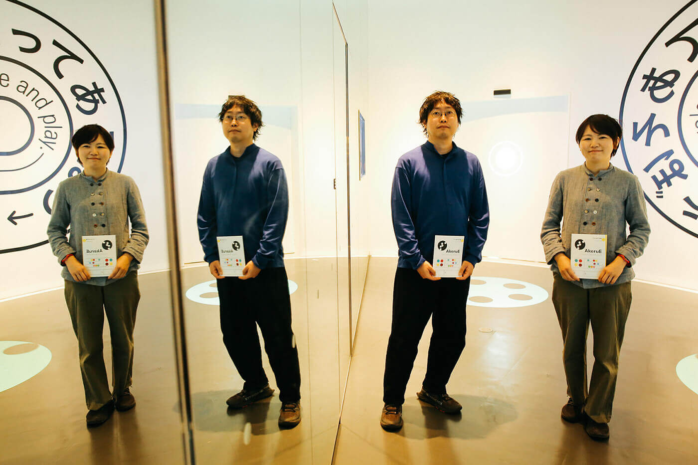
Okazaki believes that there are two kinds of human activities – “planning and executing logically” and “understanding while doing” and that they are both important for design work. Sometimes we decide on what we want to achieve and move forward in a straight line, while other times, we work on what is in front of us and later come to understand the meaning of what we are doing.
In a society undergoing rapid change, it is necessary to always have an eye for change, and just like AkeruE and its ever-turning logo, be an ever-changing entity.
Next Contents







 ULTRA TOUR by STYLY Service Development